parc
Pixel Ape Rowboat Club started in November 2021 as a joke. People were treating pixel apes as status symbols, and we thought that was ridiculous. Bored Apes had yachts. Ours had rowboats. 10,000 pixel apes on the XRP Ledger, no clout included.
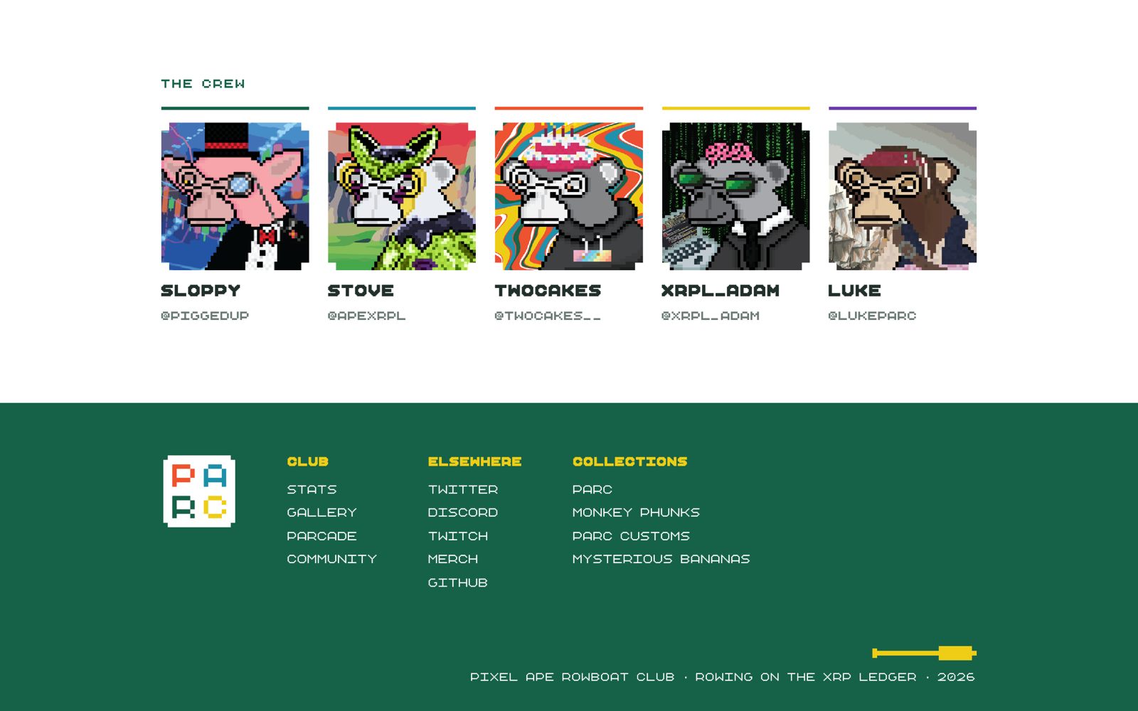
People stayed anyway. By the 2026 rebrand, PARC had four collections, a Twitch show, an arcade, merch, and its own lore. I cofounded it with xrpl_adam on development, sloppy on marketing, and stove drawing the apes with me. I’ve led the branding and art direction throughout. The old identity no longer matched what we were making.
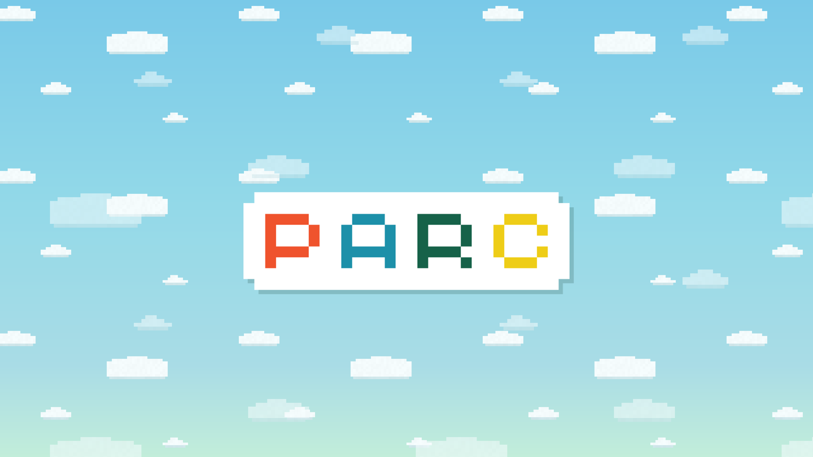
The world
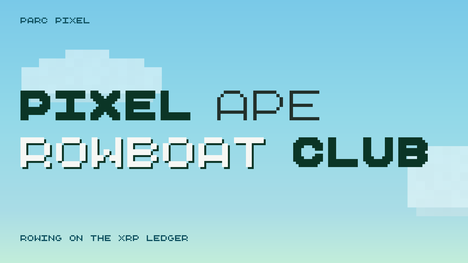
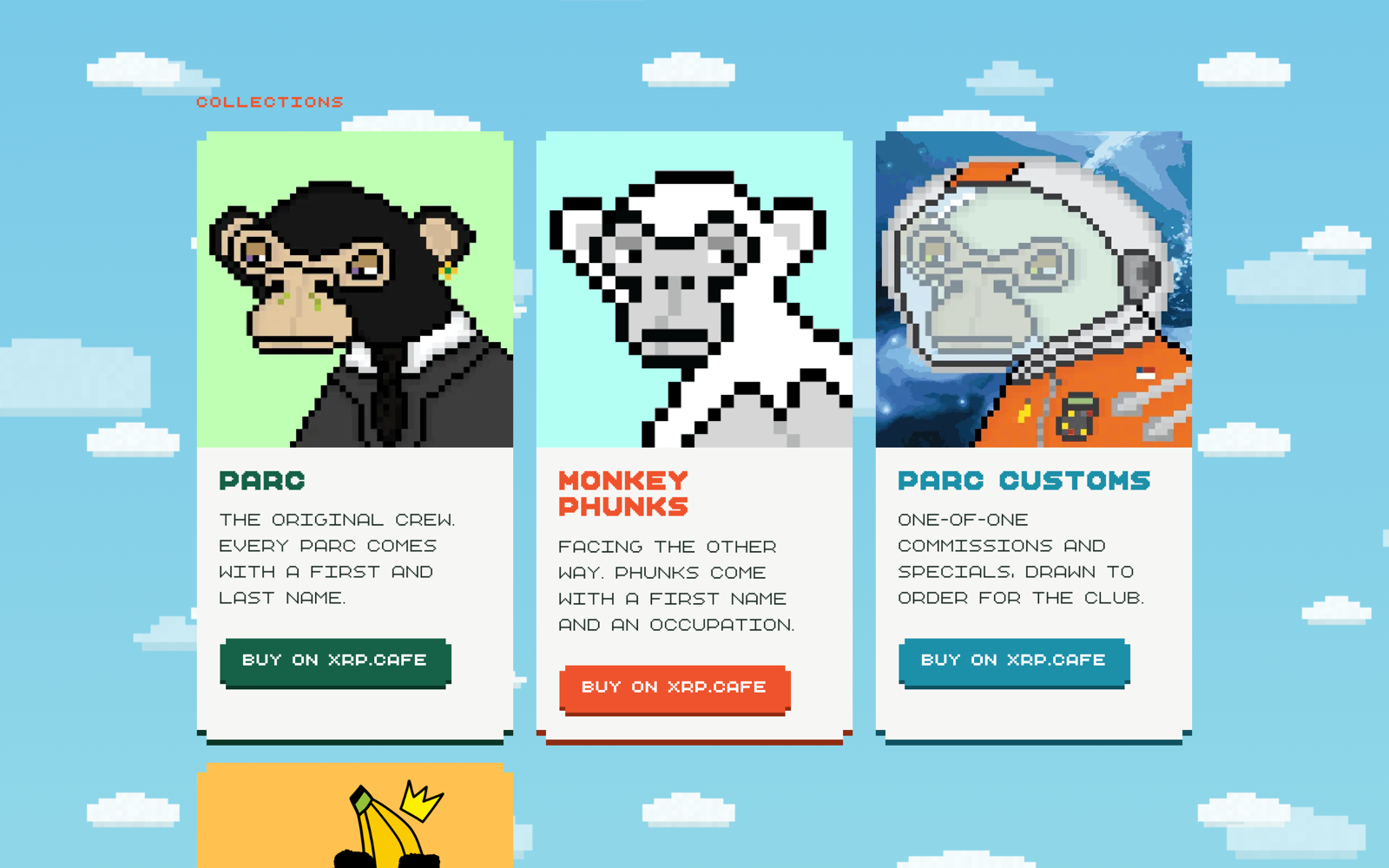
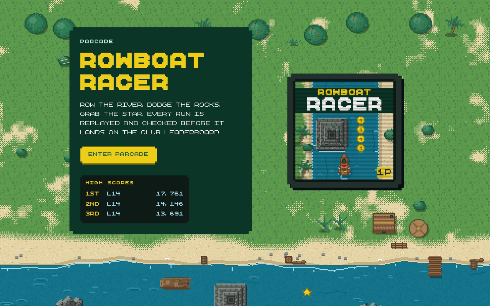
The apes started with the Game Boy Advance Pokémon games as a reference: flat color, chunky pixels, sprites you could recognize at a glance. We built a world around them with islands, rowboats, volcanoes, and wooden huts. The rebrand needed to belong in that world.
Same people, better brand
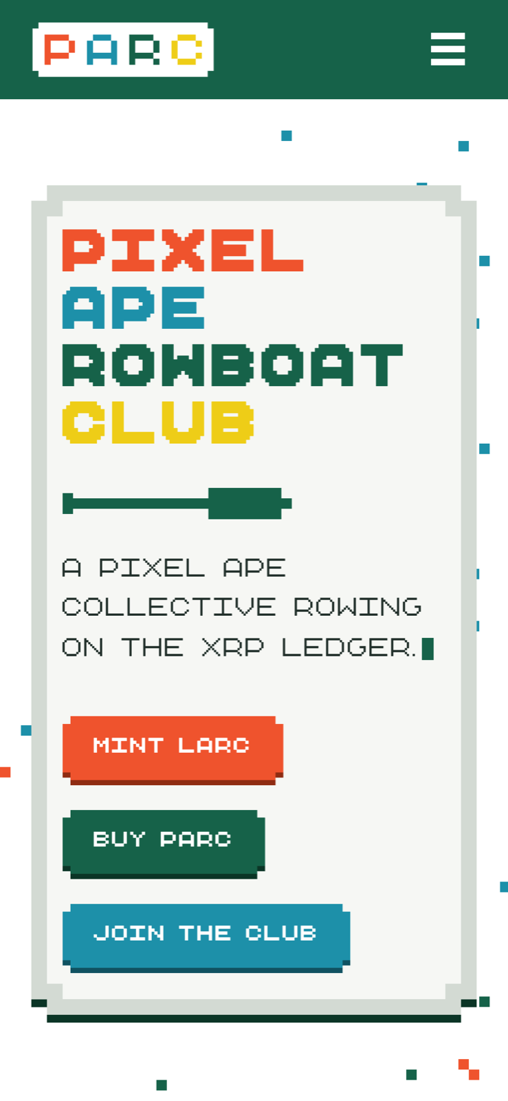
The old logo was a cartoon ape with thick outlines and a bubbly wordmark. It didn’t look much like the pixel art around it. I drew the new logo on the apes’ 5×5 grid and put it on a white sign with notched corners.
The team was attached to the old identity and worried about how the community would react. I pushed for the change. The comments after launch were encouraging.
The reaction
- 01“I know I like the new banner and logo” — RedHotDankMoist, Discord
- 02“@twocakeS these graphics is gas” — DreamballerXRP, Discord
- 03“Love it, great website update, looks amazing” — @BrandoWoodz, X
- 04“loOkn goOd” — @Uga589, X
The system
I made a wide logo, a square lockup, and an oar badge. They share a cell grid and notched corners, with two cells of clear space on every side. The final artwork uses merged paths so it can go straight into print and web files.
The palette has five colors. Individual elements use a single color; the logo uses four. I specified hex values for web and CMYK for print, and ruled out yellow type on white because it’s hard to read.
The oar works as a favicon, a badge, and a divider. I also put it on the typeface’s equals key so it’s easy to use in a line of text.
The typeface
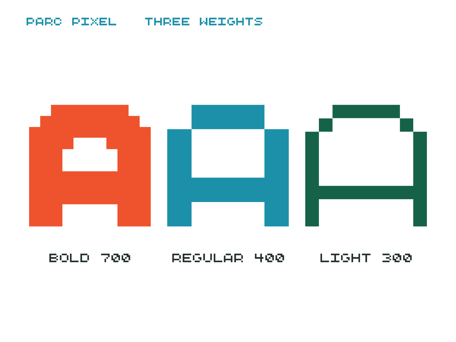
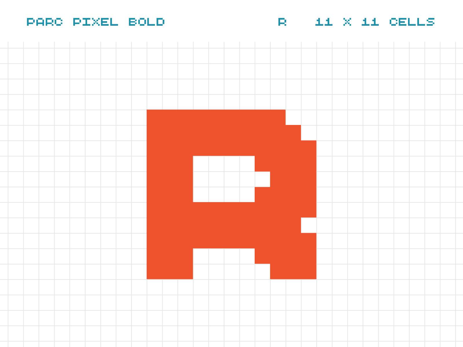
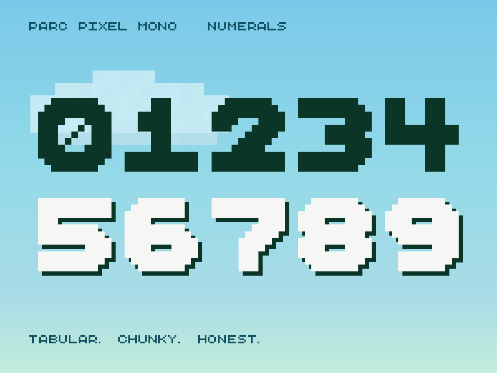
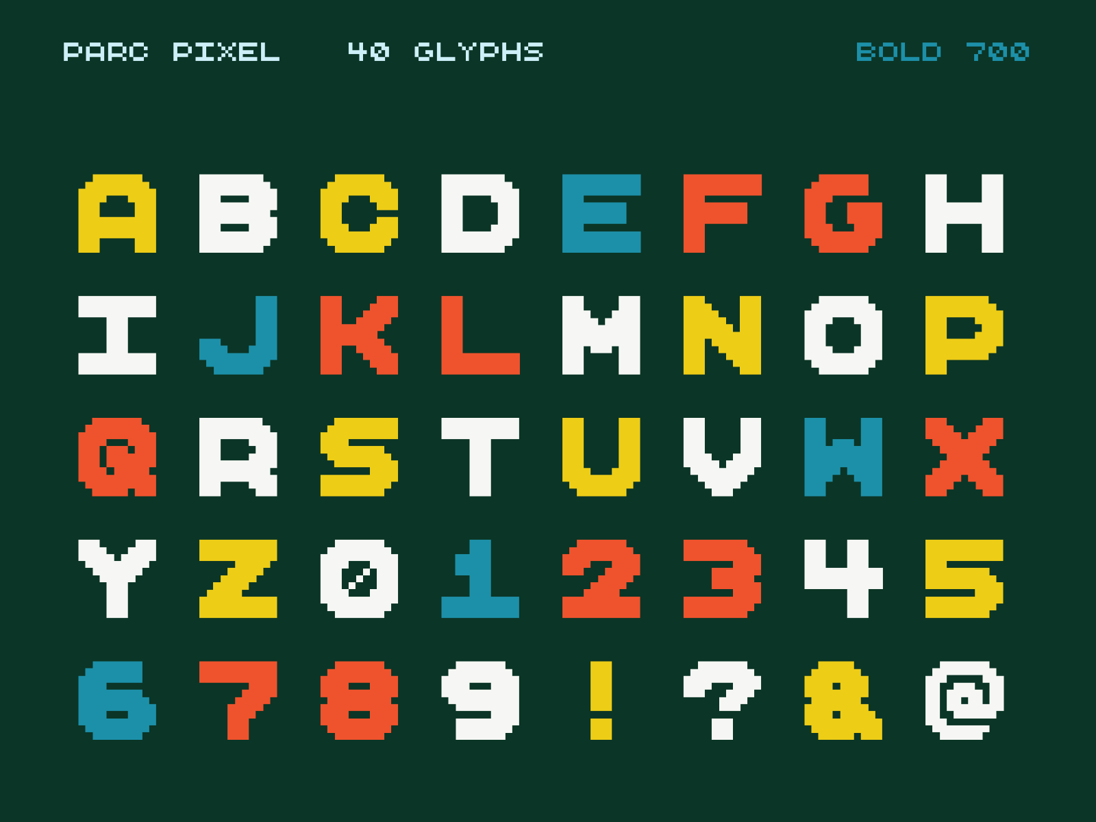
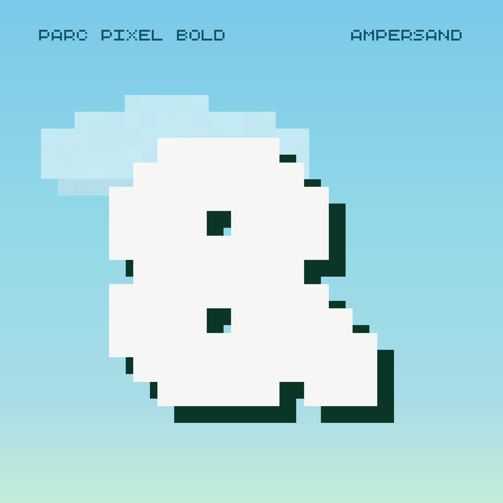
I built PARC Pixel from the four letters in the logo: one-cell strokes, open counters, and stepped diagonals. It has three weights, plus a monospaced version for scores and prices. I finished 29 glyphs by hand, including the 2 and the at-sign, checking them in words at reading size.
In the wild
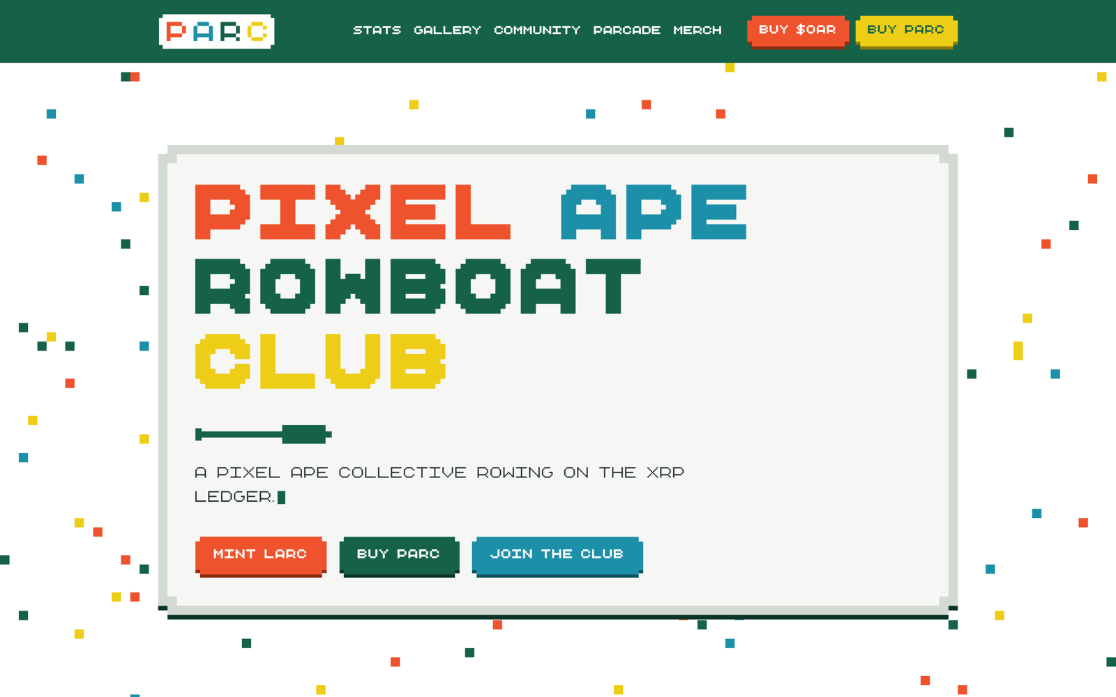
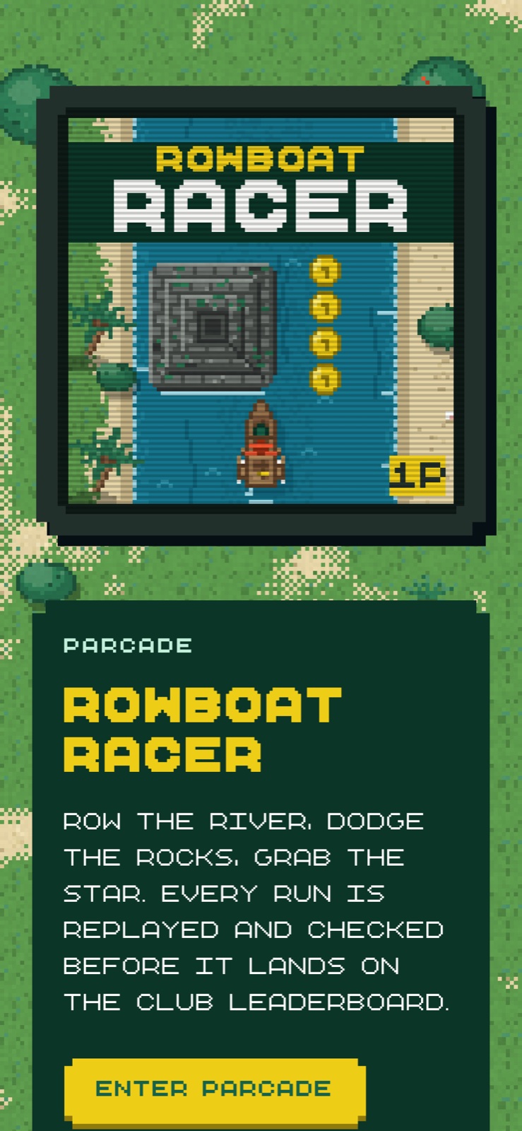
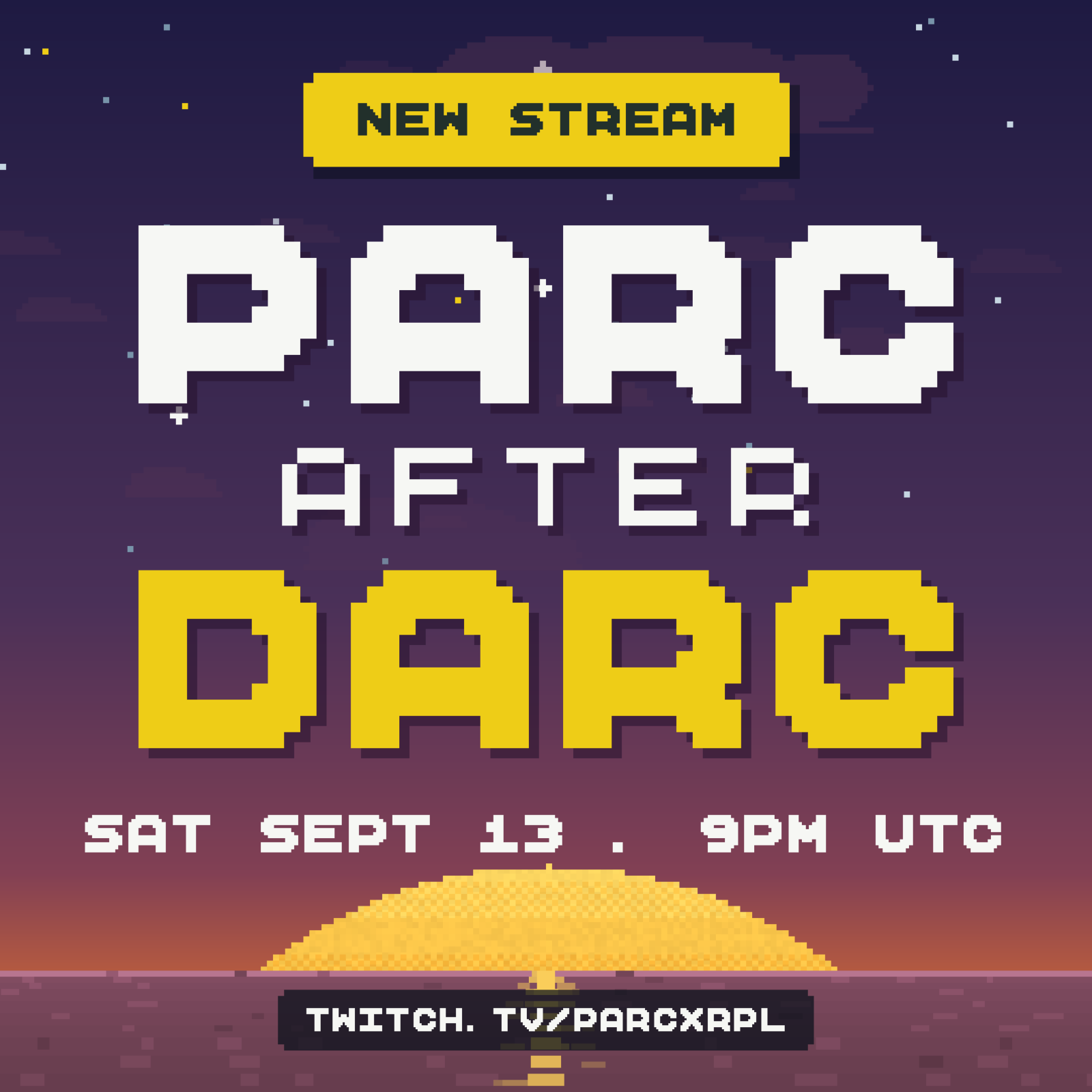
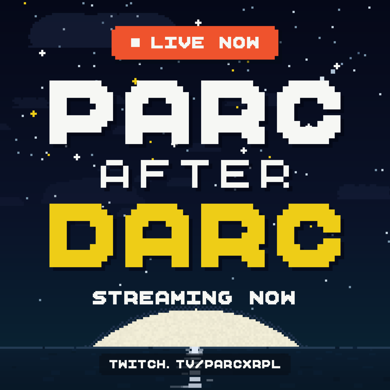
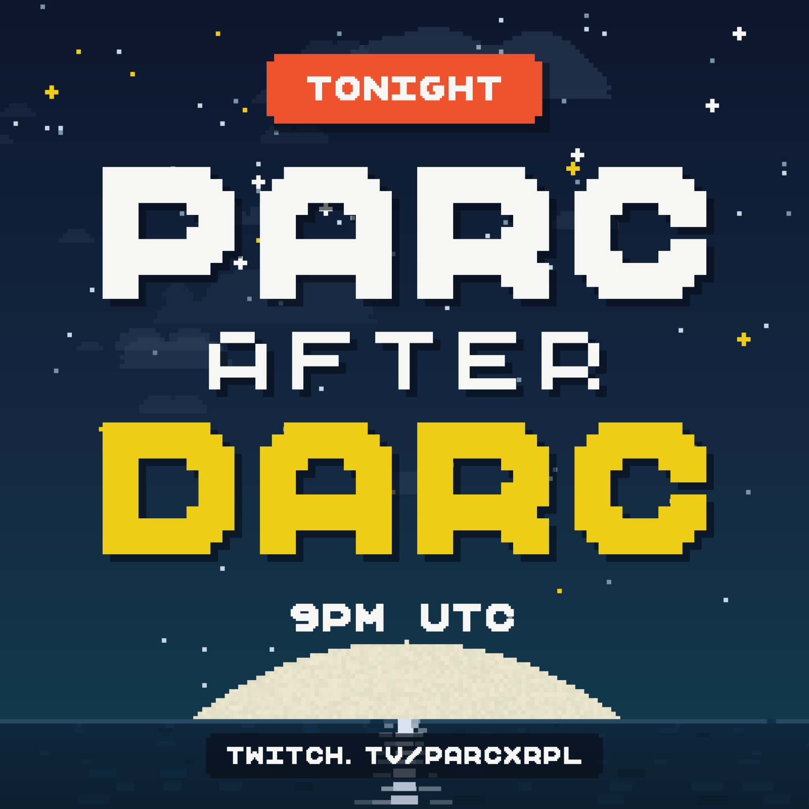
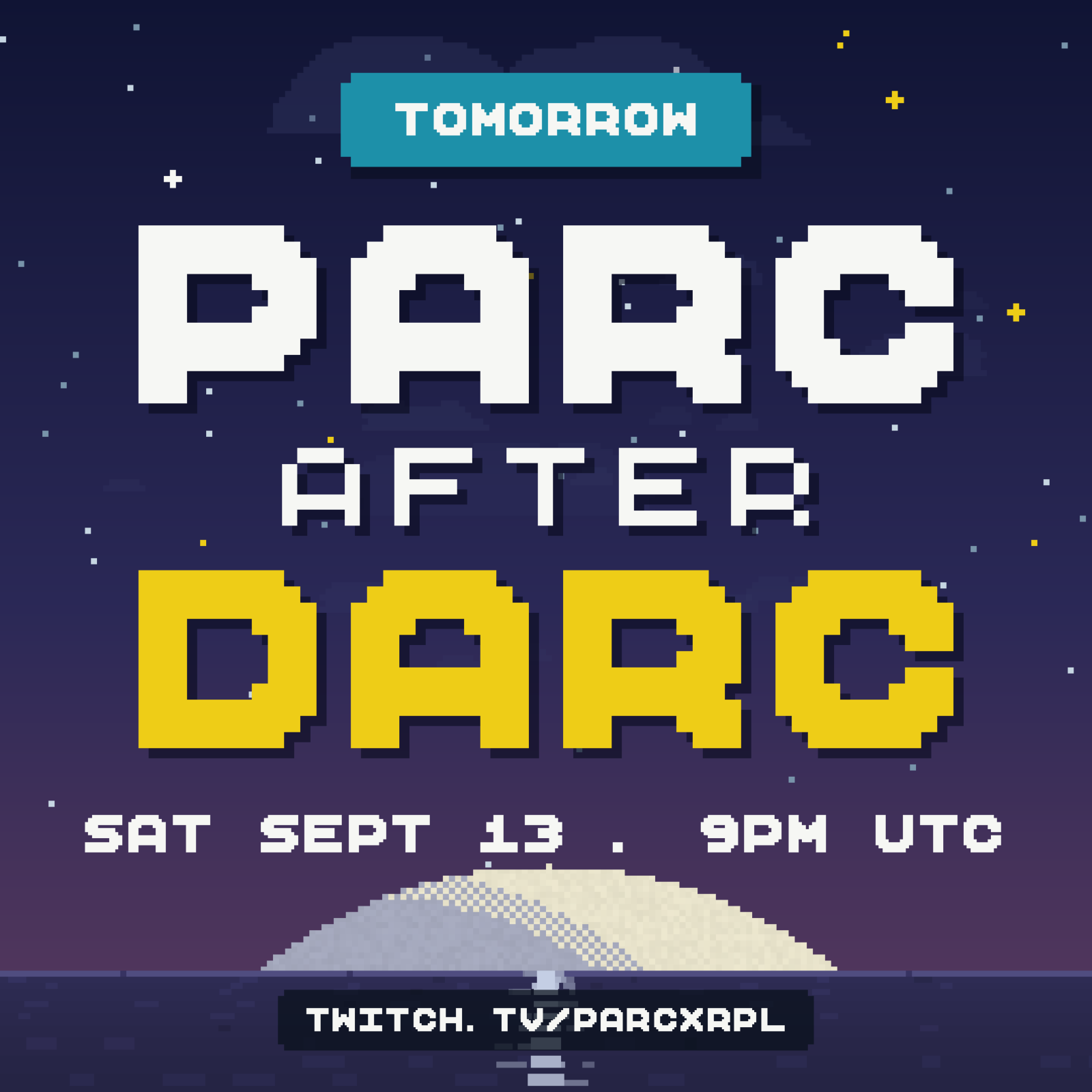
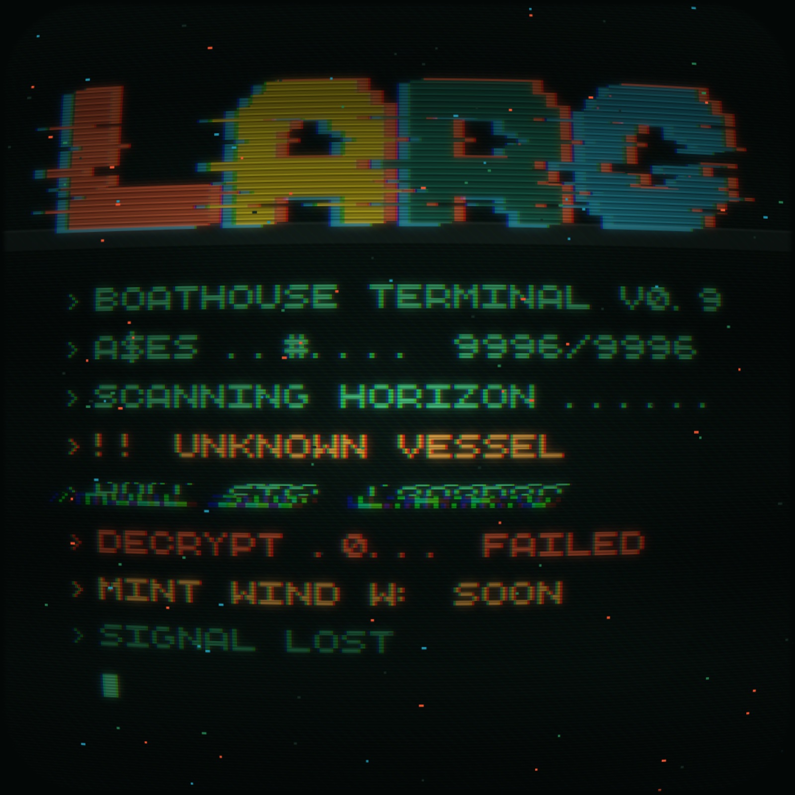
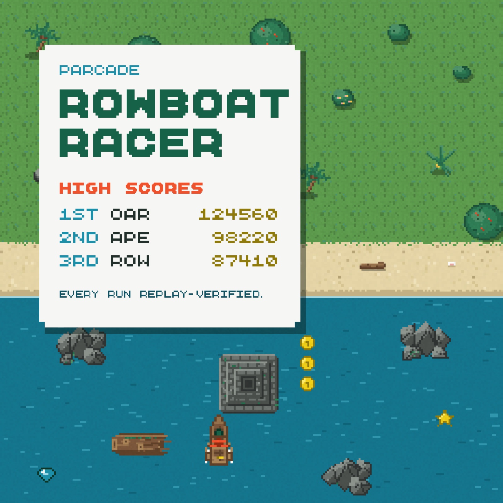
The identity appears across the website, Discord, X, Twitch, merch, and arcade. On the site, the logo hangs in the sky and the collection cards float above an island. After Darc has its own graphics and a starting-soon animation for the stream.
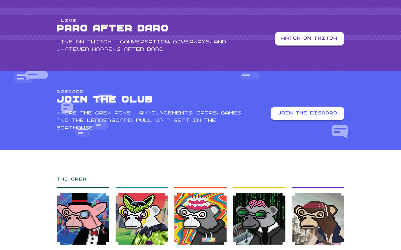
I made animated backgrounds for each part of the site: drifting clouds, a scatter of pixels that responds to the cursor, broadcast static for After Darc, and chat bubbles for Discord. They switch to still versions with reduced motion.
Outcome
- 01One logo library for both lockups and the oar: black, CMYK, Pantone, and white for print; black, RGB, and white for web.
- 02Five colors and one typeface on every surface: site, Discord, X, Twitch, merch, and the arcade.
- 03PARC Pixel: 57 characters per weight, three weights, proportional and mono.
- 04Four generated backgrounds, one per band of the site, and the game island drawn from its own sprites.
- 05The rebrand launched in September 2026.